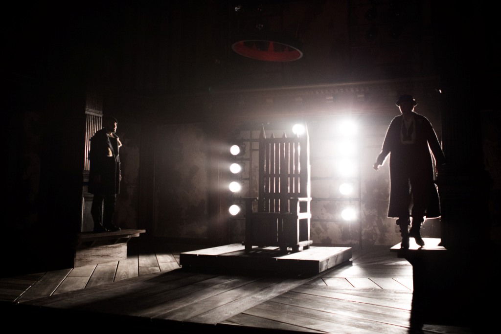
For King John, director Aaron Posner described the set as “very spare—a rough, wooden world with a few benches and some kind of throne. The feel of the world is roughly Medieval England meets Waiting for Godot … We’ll borrow some of the energy of Godot or Chaplin or Keaton—a ruined world, peopled with unique, idiosyncratic, almost archetypal characters capable of extreme passions.” To find out more about this “ruined world,” Folger Spotlight spoke to scenic designer Andrew Cohen, who offered a glimpse into the inspirations behind his set for Folger Theatre’s production.
What were your initial thoughts about the scenic design for King John, and what changed/stayed the same between beginning working on it and what audiences will see on stage?
Our initial conversations about the play lived more in how we wanted the world to feel. It’s a harsh, cold, rough, world that falls apart for John. We knew that setting it “period” is something that is fine and appropriate for the story, but maybe not as interesting and intriguing in bringing to life this rarely produced play. In its rarity, we have a unique opportunity to present it without a lot of baggage attached to it. The idea of staging it with a period set and costumes was less appealing then reacting to the play emotionally, and creating a world that sparsely and abstractly reflected how we felt it as we read for the first time. Early on, we had explored a mix of what you see on the Folger stage now, and some medieval elements (like the throne being an accurate recreation of a towering medieval throne), but in trying to do two things at once, the world felt non-committal in either direction. So we pushed it further into abstraction.
- The original rendering for King John, with the elaborate throne center.
- The final rendering for King John, with the suspended crown.
To what extent do you anticipate how the actors will interact with the set? Have changes had to made based on the rehearsal process?
The hope for any set design is to anticipate all the wonderful possibilities to create interesting stage pictures, dynamic actor entrances/exits, and interesting blocking. We knew early on that we wanted the set to be pretty sparse, and in its sparseness the ability to be very flexible and utilitarian. We had carefully thought out ideas on how to use the space in surprising, dynamic way, which was in a sense a compass for the majority of the show. What is great is that [director] Aaron Posner and the cast were able to explore additional possibilities in the rehearsal room, that we were able to implement into the design (for example, creating a wider front-of-stage staircase so it could be used as a place to sit, or for more than one person to go up and down at a time). But all in all nothing too drastic changed.

Austria (Maboud Ebrahimzadeh) and Philip the Bastard (Kate Eastwood Norris), King John, 2018. Photo: Teresa Wood.
What is your favorite part of this design?
There are a few things, particularly the added plaster texture on the Folger panel inserts, the rough wood throne, and the floating crown. These elements are some of the interesting details that illustrate our world of the play. And the floating crown is just cool, and wonderfully delightful.
What challenges or considerations did you come across in designing for the Folger’s theater?
Like all designers that come through the Folger, I had to really consider the character and presence of the actual Folger stage. The two columns, the second level balcony seating that sits above the stage, as well as the unique aesthetic of the theater. A designer has to determine if you embrace or ignore this architecture. Show it or Hide it. We decided to show it, and embrace the space as it was, with very little to change its basic layout.
 Don’t miss King John, which ends its performance run on December 2. For tickets and more information, visit us online or call the Folger Box Office at 202.544.7077.
King John
Folger Theatre
By William Shakespeare
Directed by Aaron Posner; scenic design by Andrew Cohen; costume design by Sarah Cubbage; lighting design by Max Doolittle; sound design and original music by Lindsay Jones; production photography by Teresa Wood.
Stay connected
Enter your email address to follow this blog and receive notifications of new posts by email.


